DJ and designer Jon K takes us through his influences and artwork
Better known as Jon Kraus to his friends, “Jon K” is a denizen of Manchester; a great DJ and also one of those people who also happens to have a string of talents to his bow. Fast gaining a reputation for being a selector with an immensely broad palette, along with the ability to mix together just about every genre known to man into a coherent flow. Expertly captured by his mix for FACT Magazine, he also has a reputation for being able to recite the credits of just about every b-side worth knowing too.
Part of the Hoya:Hoya club collective, Jon can be found spinning regularly alongside fellow friends Illum Sphere, Krystal Klear, Lone, Eclair Fifi, Jonny Dub & Chunky at the Roadhouse when not on his travels, or engrossed in other creative endeavours. Whilst we are reliably informed Jon is keen linguist, it’s his graphic design work that captured our imagination – not least because it’s a side of him that deserves as much attention as his music. We asked him to talk through some of his favourite pieces of work that have influenced him, and also put on show some of his favourite commissions. Lucky for us, he was more than happy to oblige and here’s what we got:
Sleeve Art:
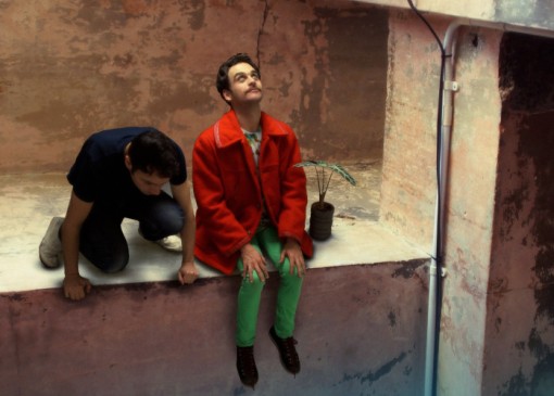
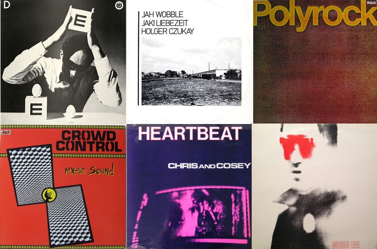
“No matter what I’m designing, the things that inform my work most are undoubtedly record sleeves because I’m always playing them when I’m working. Even on the driest of days, flicking through a few piles of LP’s will gets the cogs whirring. I’ve been influenced by all sorts but some of the sleeves I have most fondness for are Punk/Hardcore/New Wave covers from the late 70’s / Early 80’s…
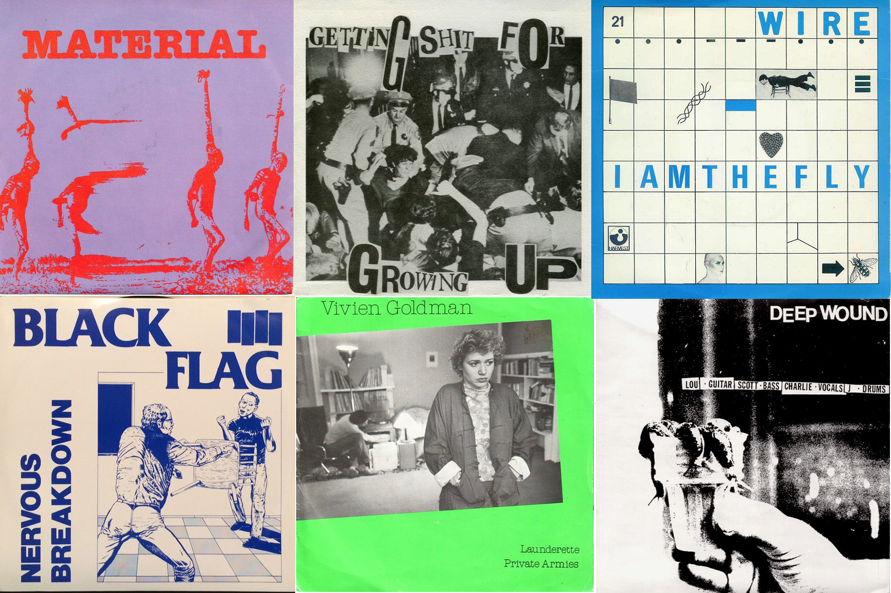 There are outrageous talents like Raymond Pettibon but in a lot of cases it was just a band member (with a pair of scissors & newspaper) and these punch their weight alongside really well designed sleeves. Jeff Nelson of Minor Threat’s covers always appealed to me, as his style was pretty timeless and broad but when you see a load of his Dischord sleeves together they make a coherent body of work. Aspects of Punk opened all sorts of ideas to me but seeing the sleeve for Discharge ‘Never again’ then checking out John Heartfield and then getting into people like Moholy Nagy was a huge influence. There’s certain labels just keep giving on the sleeve front – Industrial records, Ralph, Celluloid, Fast, 99 etc”.
Crap Hound:
“Crap Hound is a zine by Sean Tejaratchi. It’s described as an encyclopaedia of Clip Art which is what it is, although each issue focuses on only 3 topics and covers each as broadly as possible through graphics & fucked up juxtapositioning. It’s irreverent from the off and choc full of sardonic piss-taking at the same time as being visually incredible. The 3 images below give you an idea of its schtick.
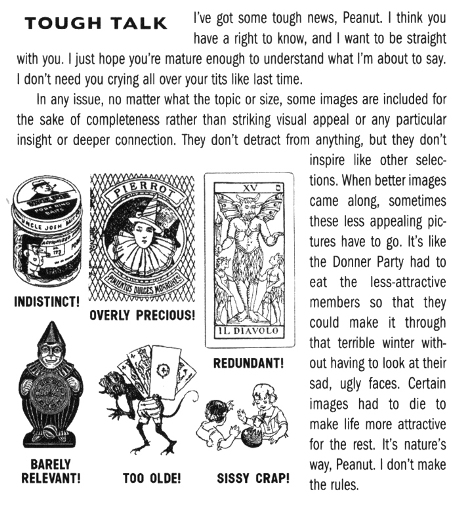
“Tough Talk” – A lot of the images used have been donated / sent in so this addresses the issue of pictures that might not have made the cut when they re-issued some out of print copies with some new imagery.
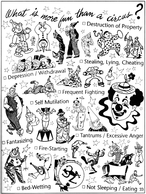
“What is more fun than a Circus” – From the Clowns, Devils & Bait issue – a creative use of a medical questionnaire and clip art clowns.
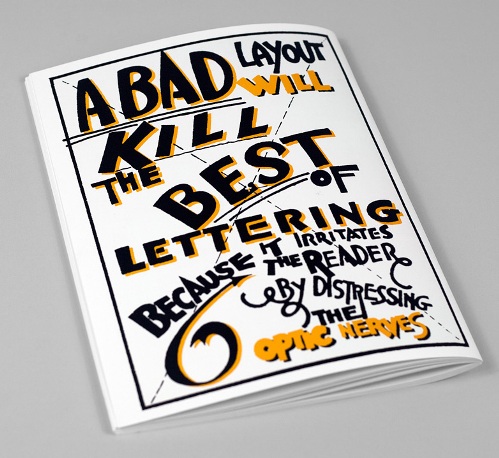
 “Crap Hound” – a zine made by a designer aimed squarely at designers, this one speaks for itself.
 Boris Mikhailov:
“Mikhailov is a Photographer from the Ukraine who’s work mixes conceptual art subject matter with photography and is known for his anti establishment stance. I’ve not actually seen a huge amount of his work but I have a book called ‘Yesterday’s Sandwich’ which I look at a lot. It includes work that pokes fun at some of the artistic restrictions imposed during the communist era, by sneaking nudity into his pictures and layering up imagery. Some of them are as daft as a brush, while others are just really odd but his colours are top and it’s a clever way of making his point whilst side stepping any whingeing.”
Coming onto to your own work – care to share a few pieces you’re particularly fond of?
Fat City Designs:
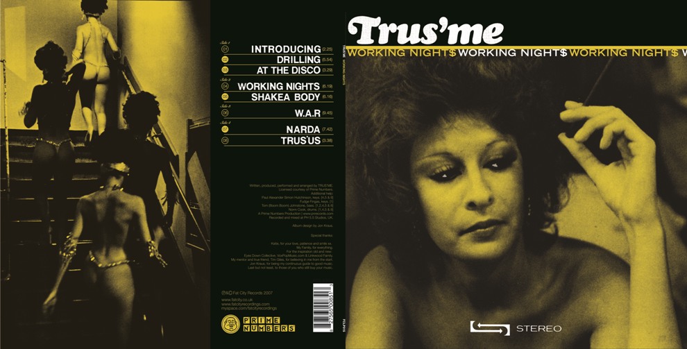
“A few years back I was designing sleeves for Fat City records and the 2 I’ve sent are ones I thought came out quite well. The Trus’me LP was a fun one as I’d given him the Rhythm Makers record to sample for the track ‘Working Nights’, which then became the title track of the LP so designing the cover felt quite personal.
 The John Robinson ‘Leak edition’ was a bit like a sampler ep so the leak referred to leaking tracks out + the first draft of the cover was an illustration of a collaged brain coming out of a leaky tap but JR thought it was too abstract. At the eleventh hour word came through that there should be a nod towards Black history / Education & Revolution so the brain got flushed.”
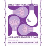
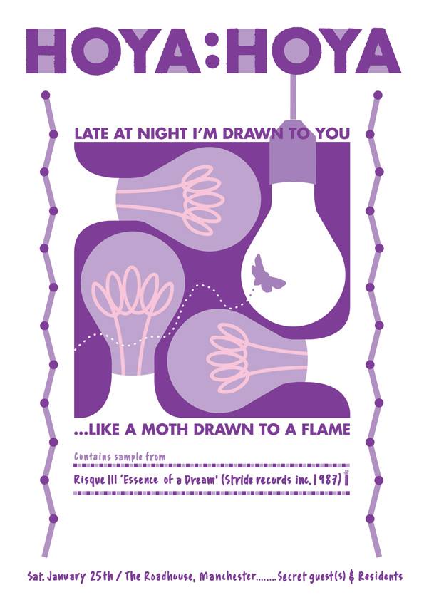
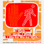
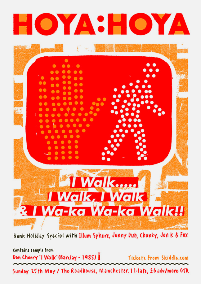
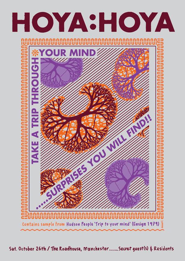
 Hoya Hoya posters:
“I’ve been a resident at Hoya Hoya since mid 2010 and in Feb 2013 (which was the night’s 5th Birthday), I started designing the Posters. We have a pretty diverse set of residents and the idea was to (without putting genres etc) give people an idea of what kind of stuff gets played at Hoya, so the lyric idea seemed like a good way to go.”
-
- Jan
-
- May
-
- Oct
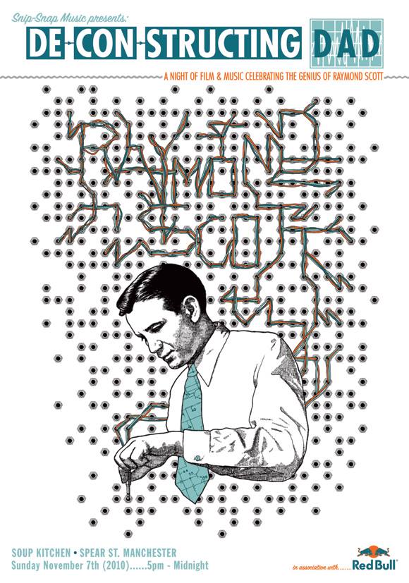
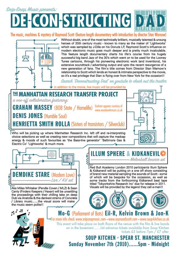
Deconstructing Dad flyer:
“This was for an event that came about when I met Stan Warnow (the son of Raymond Scott) at a film festival in 2010. Basically he had made a film called Deconstructing Dad, which I couldn’t see as it was screened the day after I was there. I knew a lot of people would be keen to see the movie so I got in touch with Stan with the idea to curate a Manchester screening that would also feature a load of live performances of music either inspired by Raymond Scott or with some reference to Concrete (in the case of Demdike Stare). The artwork was a collaboration with an illustrator called Ben Lamb who’s well known round these parts – it was great fun from start to finish.”